Thursday 27 June 2013

Marine Processing - Part 4 | Swell Noise Removal


These blog posts will build up into a complete description of a 2D marine processing sequence.  They are based on our tutorial datasets, which in turn came from the New Zealand Government’s Ministry of Economic Development under the “Open File” System.

The processing sequence we have developed so far is:

-          apply a combined minimum phase conversion and anti-alias filter
-          re-sample from 2 ms sample interval to 4 ms sample interval
-          assign a simple straight line 2D marine geometry
-          check the geometry by plotting offsets over the shots and near traces
-          true amplitude recovery using a T2 spherical divergence correction
-          trace edits using peak-amplitude analysis to identify noisy shots and channels

In this post I’m going to continue cleaning up the shot records, to get them ready for more signal processing, by addressing some of the noise issues we identified earlier.

Here’s a shot record with a swell noise burst, plotted alongside its FK response.

A shot record (left) and its FK spectrum (right);  the shot record shows various types of noise, including swell noise (red), which has a low frequency and broad spatial frequency;  tail-buoy jerk (white) which has a low spatial frequency and negative (tail-to-head) dip, and the direct/refracted arrivals (purple) which are spatially aliased


The swell noise shows up as low frequency (in this case less than 5 Hz) energy with a broad spatial frequency band (indicated in red). This overlaps with the tail-buoy jerk (white) which is also low frequency, but dips from the tail of the cable to the head. These often occur together, with liquid-filled seismic streamers; modern streamers achieve their neutral buoyancy through foam not oil. The motion of the tail-buoy over the sea swell sets up waves that propagate through the cable, creating the noise.

The direct and refracted arrivals are highly spatially aliased (purple) and wrap back over the reflected signals we want to preserve; the aliased data crosses the K=0 axis at about 62.5 Hz, which is at the high end of our frequency band. We can also see some periodicity in the FK plot indicating short period multiples, as well as the back dipping (tail-to-head) reflections caused by structure we extend below the K=0 line.

The combination of the XT and FK displays suggest approaches we can use to tackle these noise issues, the main one of which is swell noise.

We can:

  • throw data away by editing the traces that have swell noise present
  • address the swell noise and tail-buoy jerk by removing only those frequencies
  • address the swell noise and tail-buoy jerk by muting them in the FK-domain; retaining the low frequency signal (along with some noise) around the K=0 axis

There is also another technique we can use called “projective filtering”; this takes a moving time- and space- window and looks at the frequency content, aiming to locate and scale back anomalous low frequency noise within a trace automatically.

Firstly I’ll define a window below the direct and refracted arrivals for the technique to be applied in. This will avoid introducing artefacts into the data, which can happen at sharp amplitude boundaries. Most software allows you to design a spatial application gate in this way, above (or below) which the process isn’t applied.

Secondly, when I go into the FK domain I’ll use a removable AGC which will also help to avoid any amplitude complications.

FK Domain mute designed to remove swell noise and tail-buoy jerk, while preserving low frequency reflections.  Data above the red line will be muted in the FK domain


Both of these approaches will help to remove artefacts.

For the FK approach, the mute I have picked is designed to be above the direct and refracted arrivals, including the aliased components; we’ll worry about those later.

A single shot with (from left to right) no swell noise suppression, a 5 Hz-10 Hz low cut filter, an FK Mute (with AGC “wrap”) and projective filtering applied to combat swell noise.  The blue line is the peak amplitude within a “deep” window, showing how the swell noise has been removed


These are the four basic processes we can test; we could of course vary the low-cut filters, or modify how the FK mute was applied – however the projective filtering is very effective in this case.

It is also important to look at what is being removed from the data by calculating “difference” plots to make sure that we are not removing signal.

A single shot record with (from left to right) no swell noise applied, a low cut 5 Hz-10 Hz band pass filter, and the difference plot showing what has been removed.  The swell noise is being removed, but so is some reflected energy.  The blue line shows the peak amplitude on the trace

If we compare the band-pass filter approach to the projective filtering, we can see that this removes less signal:

A single shot record with (from left to right) no swell noise applied, projective filtering, and the difference plot showing what has been removed.  The swell noise is being attenuated, but without removing any of the reflection energy


Finally, here are the FK plots from the input data and the same shot with projective filtering applied (as an additional check):
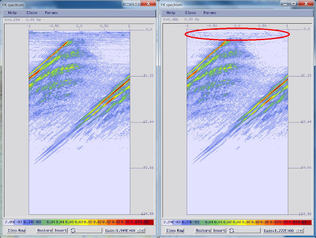
The FK spectra of the input shot record (left) and after projective filtering (right); the signature of the swell noise and tail-buoy jerk (red) have been attenuated


If you were testing this, in practice you would use more than one shot; a selection of shots from along the line, ideally ones that you have identified as having swell noise issues as part of the noise QC tests you have run so far.

In this case I’ll continue processing using the projective filtering.  If you didn’t have this available then varying the filter (or the frequency “cut” for the FK mute) can increase how harshly the swell noise is attenuated, but of course can cost you signal.

One of the techniques you can employ is to select just the traces with significant swell noise for the harshest filtering.  In our software you can store the peak amplitude in a trace header and then select traces where this exceeds a given value.
 
Now we have de-spiked and “clean” shot records. The next thing we need to address is the strong linear noise from the direct and refracted arrivals.


By: Guy Maslen

Monday 10 June 2013

Marine Processing - Part 3 | Amplitudes & Spikes


These blog posts will build up into a complete description of a 2D marine processing sequence.  They are based on our tutorial datasets, which in turn came from the New Zealand Government’s Ministry of Economic Development under the “Open File” System.

As a recap, so far I have discussed:

-          marine source signatures, minimum phase conversion and resampling
-          assigning the 2D geometry, and some initial QC checks of the data

The next thing we need to look at is the seismic trace amplitudes. 

The strength of the seismic reflections we see decreases with the depth of the reflecting surface. There are several reasons for this but the main ones are that:

  • as the wavefield spreads it loses energy; this is known as spherical divergence. The same amount of energy is spread out over a larger surface - like blowing up a balloon   
  • as the energy travels it is scattered; the Earth is not homogenous and when seismic waves encounter variations, wave fronts are distorted and energy is deflected in all possible directions – seismic scattering

Typically there are two different corrections needed to account for this; a spherical divergence correction and a gain function. These vary with geology, and so for any given dataset they are something we need to test and confirm before applying. 

If you are new to processing it is worth a quick recap of testing approaches before you carry on.

There are usually many options for the spherical divergence correction; terms related to powers of the seismic velocity (V), offset (X) and time (T). This is a large parameter space to search from the outset.
   
Linear gain testing is usually based on a series of decibel per second functions (as opposed to amplitude scalars) which offers a simple way to express an exponential gain function.

A typical test “suite” would be to test a few of different spherical divergence corrections such as T2, T2V and perhaps T2V2, as well as linear gains of 1dB/second, 1.5dB/second and 2dB/second, and then review the results and adjust them if needed.

Here’s the output of a test sequence for different Spherical Divergence corrections. Corresponding amplitude decay curves are also shown. I’ve put a full trace balance onto each display so we can clearly see the relative amplitudes panel-to-panel.

A single shot record with: no spherical divergence correction (top); a T2 function spherical divergence (middle) and a T2V spherical divergence correction (bottom). The amplitude decay functions are plotted alongside as power spectra in dB. The T2V panel (bottom) appears a little over-gained in the last 1000 ms.  

In this case, the middle panel with the T2 function looks to be better scaled than the T2V function; this is more obvious on the amplitude decay power spectra and curves. 

In practice you should apply these tests to a selection of shots from the whole line, ideally looking at different geological settings. 

It’s a good idea to generate a stack with your chosen amplitude recovery applied as well.


Brute stack with no true amplitude recovery (top); T2 spherical divergence correction applied (bottom). Both sections have only had a balance applied, to enable comparison.

The stack shows that perhaps we could apply an additional linear gain, but as the shots are reasonably well balanced we can make that choice later if needed.

The other aspect of amplitude to consider is the presence of unusually high amplitude noise bursts.  There are a variety of possible causes, from sharks biting the cable though to digital spikes caused by loose connections in the cable (on older surveys). If we leave these in place they can cause significant problems, as can be seen in the example in the blog entry on Automatic Gain Control 

One way to check for these “spike” problems is to look at the peak amplitude on every trace.  This analysis needs to be in a window that is under the direct and refracted arrivals, as these are high amplitude. Some software allows you to plot this as a graph over the data, but the best approach is to display it as a graphical colour coded display, with channel on one axis and the shotpoint number on the other.

The peak amplitude on each trace, displayed as a colour coded grid (right); the X-axis is the channel number, and the Y-axis is the shot point number. The single red square is at shot point 114, channel 116. This shot record is displayed (left); you can see the swell noise burst on the inner channels that corresponds to these higher amplitudes.

The amplitude display plots are a useful way to look at the data, especially if there are a lot of spiking traces. Swell-noise bursts will tend to dip from upper-left to lower-right, as the cable is pulled through the area where the wave is breaking. Vertical lines are bad channels – you can see some unusually faint channels on this display. 

Bad shots show up as horizontal bars – these can be caused by corrupted files or “misfires” where one or more airguns fire out of sequence.  On older systems electrical interference or short-circuits can corrupt the whole record.

Bad channels and bad shots are the key things to edit out; things like swell noise bursts can be addressed in other ways.

A shot record with a swell noise burst on the near channels [102-114] (left); the shot record has a spherical divergence correction applied. The swell noise (which is at the surface) is much higher in amplitude than the reflections, especially in the last 1000 ms of data. In the FK plot (right), the swell noise can be seen as a broad stripe at the top of the plot – it is low frequency (mainly under 5 Hz) and has a broad spatial frequency between +/- 1.


In the next blog, we’ll look at removing noise from the shot records, including swell noise and the direct/refracted arrivals.


By: Guy Maslen

Wednesday 5 June 2013

Marine Processing - Part 2 | Initial QC & Geometry


These blog posts will build up into a complete description of a 2D marine processing sequence.  They are based on our tutorial datasets, which in turn came from the New Zealand Government’s Ministry of Economic Development under the “Open File” System.


Following on from the previous post in this series - now that we have minimum phase shot records at a 4 ms sample interval, we need to review the observer’s logs and do some quality control checks on the data.
 
We’ve already covered a lot of the basics for a 2D marine line so we can focus now on the specifics of the seismic line I’m working with:

  • FFIDs are the same as shotpoints in this case; from 100 to 975 with none missing
  • There are 120 channels, with channel 1 furthest from the boat. The group interval is 25 m, and the near offset is 258 m.  This makes the far offset (119 x 25) + 258 = 3233 m.
When we sort the data to Common Depth Points (CDP), also known as Common Mid Points (CMP), the “natural” CDP spacing is half the receiver spacing; so in this case 12.5 m.

The number of traces in a CDP gather is referred to as the fold. This is sometimes expressed as a coverage percentage: single-fold = 100% coverage, sixty-fold = 6000% coverage, and so on. 

Fold = (Receiver Spacing x Number of Receivers) / (2 x shot spacing)
Fold = (25 x 120) / (2 x 25) = 60

For more on seismic acquisition in practice, including fold and CDP, visit this web page

The first things to do are to look at the data – a few shots along the line and the near-trace-plot is a good start.  Here’s what our shots look like:

Every 100th raw shot from the line with shotpoint number and channel labelled at the top 

There are only 120 traces per shot record, and no sign of any traces that have a trace type not equal to one (trace type 1 = live), so we don’t have to worry about any additional non-seismic auxiliary traces.

It is also a good idea to check the number of traces; in this case I have 120 traces per shot, and (975-100) + 1 = 976 shots – so there should be 117120 traces in total.

Looking at the data, there are actually quite a lot of issues on these shots we are going to need to think about as we process the line, partially because the geology is quite complex.

First of all the water depth is quite shallow, so much so that you can’t easily tell apart the seafloor reflection, direct arrival and refracted seafloor. 

Looking at the direct arrivals and refractions, these get quite a lot worse as we go from low shotpoint numbers to high ones; we also seem to have more reverberations and lower frequencies on the high shotpoint numbers.  All of this suggests hard rock with a high seismic velocity coming up towards the seafloor.

At time 4000 ms – 5000 ms, you can see some low frequency rumbles; on shotpoint 200 there’s some energy that dips from the tail of the cable down towards the head. This is referred to as “tailbuoy jerk” as it is caused by the tailbuoy riding over waves and jerking the cable. There’s also the “low frequency rumble” of swell noise.

Detail of SP 400: the low frequency, high energy "stripes" are swell noise

Detail of SP 200: minor swell noise along with tailbuoy jerk, a low frequency dipping event (upper left to middle of the plot)

Detail of SP 400: linear direct and refracted arrivals, as well as (hyperbolic) reflections

Detail of SP 900: the faster (less steeply dipping) refracted arrivals, and loss of signal showing how the geology changes 

As part of the processing sequence we will have to manage all of these – everything that is not a seismic reflection is effectively noise.

The next thing we need to do is to sort out the geometry, so that we can compare what we think the geometry should be to the actual data. In most software the setting up of a 2D marine geometry is pretty simple – you assume the streamer is being towed directly behind the boat (and so the offset is a simple function of the channel number), and the CDP number is a function of the shot number and the offset.

In our case the OFFSET = 258 + ((CHANNEL - 120) x 25), as there are 120 channels that are 25 m apart and channel 120 is the near offset, 258 m from the source.

The midpoint between this near channel and the first shot is 129 m, or a little over 10 CDP spacings.

The midpoint between the far channel (at 3233 m offset) is 1661.5 m, or a little under 133 CDP spacings.

If we set the first CDP to be 100 (corresponding to the far offset on the first shot), then the trace generated by the near channel will be at CDP number 233. For the second shotpoint, we will have moved along by 25 m, (or 2 CDPs) and so the far channel will correspond to CDP 102, and the near channel will correspond to CDP 235, and so on.

There are a couple of things to note about this. If we take two CDPs from the middle of the line (say CDP 400 and 401), then they look like this:

The key things to note are:
  • Odd and even CDP numbers have different offset values, but the same number of traces
  • The spacing between traces in the CDP gather is 50m, i.e. every second receiver
  • The even CDPs don’t have the “near offset” trace in them
  • The odd CDPs don’t have the “far offset” trace in them

This pattern becomes important later on in the processing sequence, especially for processes that work on common offset planes.

Having assigned the offsets, there are three things we can look at as a check:

  • shots
  • the near trace plot
  • a “brute” stack

Shot records displayed with the direct arrival time calculated from the offset (displayed as a red line). In this case the speed of sound in seawater (1500 m/s) was used to convert the offset in metres to a two-way-time value

Offset (red line) overlaid on shot record; it matches the first break, meaning it is correct 

On both the shot record and near trace plot displays, we can calculate the time of the theoretical direct arrival based on the offset and the speed of sound in seawater, which is usually in the range 1480-1500 m/s. By plotting this as a line on top of the seismic, we can verify the offsets and the timing of the shots.

Part of the near-trace (channel 120) plot with the predicted time of the direct arrival (as calculated from the offset - displayed in red); this aligns well with the first arrival of the data, confirming the near offset and the absence of any gun delay 

To create a “brute” stack you will need a basic velocity model; this should be a single simple function. The velocity model is often drawn from some regional geological information – you may also have the capability to make some rough velocity measurements with a “hyperbolic” ruler on the shot records, for example. You could also output semblance spectra from the shots and pick a velocity model from that, to be used to create a brute stack.  

The basic approach is to gather the data by CDP number, flatten the hyperbolic reflection events using the normal moveout (NMO) correction, and then stack (sum) the data to improve the signal to noise ratio.

The sequence is:
  • Read in the minimum phase data at 4ms sample interval
  • Apply the geometry we have defined
  • Sort the data to CDP
  • NMO correct with a simple function
  • Stack the data

When you apply the NMO, you can use an “automatic” stretch mute at this stage. These are used to avoid low frequency artefacts on the data when the NMO correction is large in the shallow portion of the section.  As a side effect, they will also tend to remove refracted data.

In this case I’ve used a velocity function that has only a few points:


The “brute stack” gives an initial look at the structure of the line; it is a good idea to plot the “fold” of coverage (the number of traces in each CDP) on top of the stack as a check.
 
Now we have the geometry resolved and checked, we can start to look at the data in more detail, and start to test some different processing sequences to make improvements.

The brute stack of the line, with the fold pattern overlaid (multiplied by 10); the data is un-scaled but you can still see the basic geological structure. The CDP numbers and shotpoint positions are both labelled.


By: Guy Maslen

Total Pageviews